

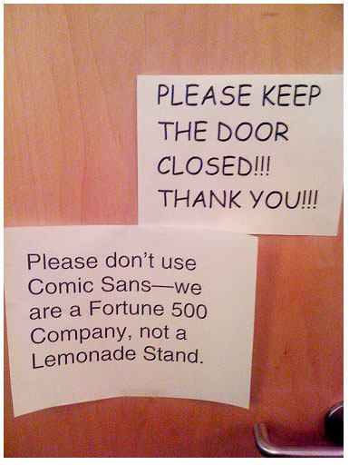
Since we all LOVE hating on Comic Sans, I thought I would share an article from my Design Rhetorics class. I know you guys will enjoy it.
http://www.mcsweeneys.net/articles/im-comic-sans-asshole
I posted about Comic Sans before, but this article just makes me laugh too much not to talk about it. Though we have heard the defense of Comic Sans, that it may help people with dyslexia, I think the origin of the font is important to why it is appalling despite its apparent helpful nature. In the same class, we learned that Comic Sans was originally created for DOS systems, hence its odd weighting and outdated look.
As the article makes clear, Comic Sans is a 90s jock. It’s the font that just wants to have fun and does not care to be art in anyway. It wants to lighten the mood, even if it seems horribly inappropriate. It thinks being loud and annoying is an asset. Underneath, its insecure and finding out fast that its being left behind for an era where being nerdy or a hipster is now cool. Should we pity Comic Sans? Maybe not. In the meantime, we can certainly pity those who use it, stick our hipster noses up, and scoff at the font.
Hilarious article! Although it makes Comic Sans a little more endearing to me, like it has great ironic value.