
TYPOGRAPHY! I AM SO HERE FOR IT. If you have been keeping up with me instead of the Kardashians then y’all know that I am OBSESSED with typography. Call me shallow if you will, but I LIVE aesthetically pleasing websites, fliers, posters, syllabi, anything with words on it that depends on design elements of not just the content on the card, but where to put it and why to put it there. AMAZING.
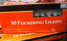
And as a result Ellen Lupton became my homegirl. She writes about letters and text and it’s so dope. Let’s dissect her writing on text to beginning with kerning. Incredible, kerning an adjustment to spacing between two letters and it’s something that we don’t typically think about because who cares about the space between letters it means nothing, right? WRONG. It is so important because it’s what causes really embarrassing signs such as this one: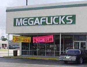
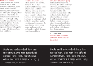
KERNING, KIDS! Then there is tracking which is letterspacing. WILD I KNOW. It differs from kerning in that it’s about the whole of letter spacing rather than the space between just two letters. This contributes to the overall formatting of a text which is so rad. Ugh look at this beauty: