

A friend of mine is a graphic designer and he showed me this talk a few weeks ago. I thought it was really awesome and inspiring and it has to do with literacy and typography(!).
In it Eric Hu talks about how during his schooling, design and typography are taught from a mostly Western perspective focusing on the Roman alphabet, and not really mentioning typefaces or fonts for logographic systems or script writing systems. This realization inspired him to become literate in Asian/Eastern design, and he looked towards exploring his own heritage as a starting point.
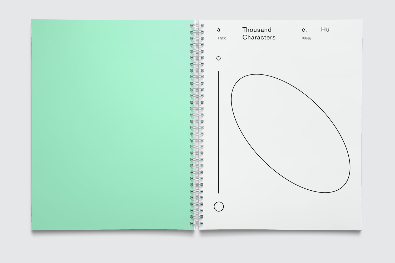
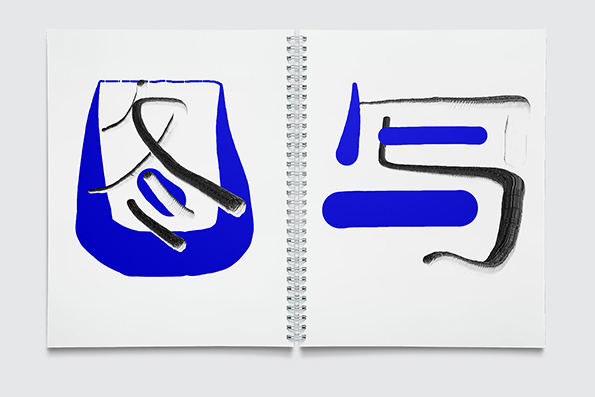
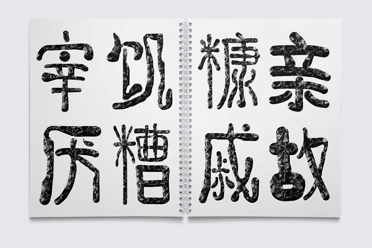
To do this he needed to become proficient in drawing with the mouse, so he did a project called 1000 Characters which was a unique illustration of 1000 non-repeating Chinese characters in a poem. He used a dynamic drawing application that he programmed in Processing then manipulated further. In his program, the top portion of the screen is always a thin weight, and slowly gets thicker as you travel down to the bottom of the screen. This makes for interesting compositions that have some similarity. He uses Photoshop to later change the strokes and framing. In another project, he collaborates with others to make the unluckiest posters in the world that are comprised with taboo symbols from different cultures. His work is a cool intersection of art, design, typography, programming, and heritage.
I would recommend checking out his projects if you are interested. He is an adjunct faculty member at Parsons and has worked for OKFocus, a web development company run by Ryder Rips, creator of Dump.fm He runs a personal tumblr and also another called graphic resign. In his personal tumblr, he gives honest feedback to students who ask questions for free!
Blame! as the first image on his tumblr? Guy’s got good tastes.
Worked with processing for a bit, so I can see what he’s doing here; Chinese characters as an art form has been revered for some time i.e. fanaticism with calligraphy, though it’s interesting how he’s blending the medium with technology and a postmodernist look. Would’ve been interesting if he also developed usable, artistic font types for Chinese characters as well.