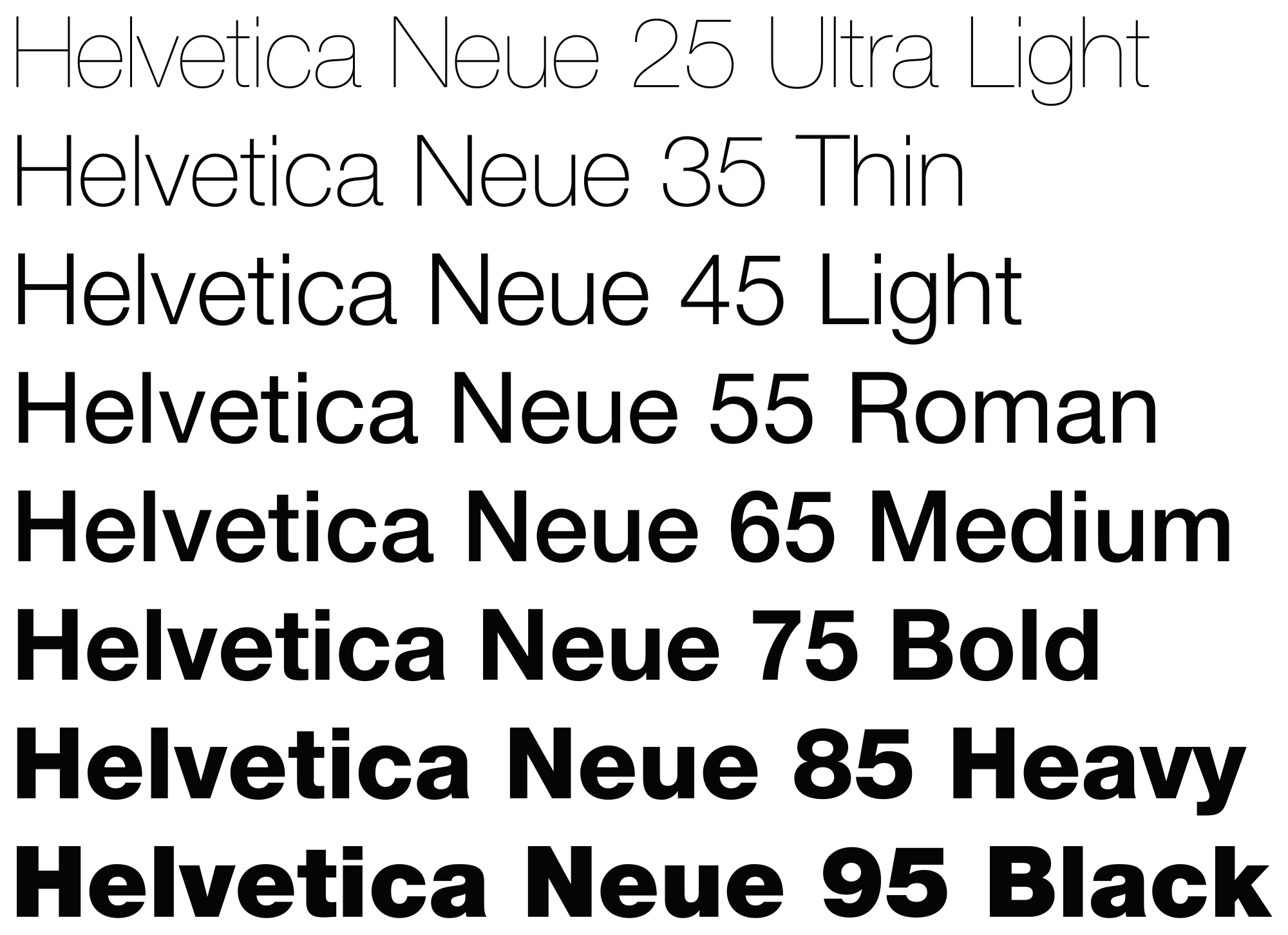
While looking over the “Thinking with Type” reading all that I could really think about was my Focal Point class I took freshman year. The class was titled “The Power of the Visual Image” and while we focused on photography and visual mediums we did spend a portion of the class looking at font. I will admit that this class wasn’t extremely interesting to me – I’m just not visually creative. But the section where we focused on type was fascinating. We watched this documentary (for the life of me I cannot remember the name) that explored the evolution of type in marketing.
One of the biggest things it highlighted was how marketers have honed in on one specific typeface – think Target, American Outfitters, etc. – Helvetica. There has been this major shift in marketing towards the use of Helvetica because the font is clear, concise, and simple. This simplicity is what brands want their consumers to think about them – that they have simple ingredients, instructions, values. I found this very interesting that a font is extremely important in marketing and can relay brand values. This got me thinking what is everyone’s font for brands? Why do you think does this typeface appeal to you so much? Does this font show the brands values?


Whenever I think of Helvetica I think the following; “grassroots,” “green,” “responsible,” “contemporary,” “socially conscious,” “ethical.” I definitely feel the same way about the simple but moral value that Helvetica projects. I’m not sure what came first– if people feel this way about the font and then people put it on products they want consumers to feel that way about; or if people see that font on those types of products and it creates that association.