

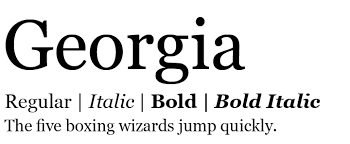
I love fonts. I really do. My favorite is Georgia. I always make it my default font for any blogging that I am doing. I’m sure why, but I love it. It’s like a chiller Times New Roman, which I also really like, but it’s a little too serious for me. Actually, I love, most serif fonts. They just speak to me. Non-serif fonts are fine or whatever, but if they were real people they would be super into norm-core, Titus Andronicus, and discussing politics from a white perspective. Also, Comic-Sans is hell. It is the family guy loving, fedora wearing Meninist of fonts.
I love fonts, but not like my friend likes fonts, In fact, she loves fonts so much that for her Bat Mitzvah, her theme was fonts. She stuck the people she didn’t like but had to invite at the comic-sans table because no one in their right mind likes comic-sans.
Anyway, due to my devotion to the love of fonts and the obvious effects it has on the people surrounding me I would like to research on the effects typography has on humans. Why is it exactly that I live for the Georgia font? Why does Comic-Sans exist if everyone hates it? How were these things decided? All of that and more can be found on the research paper I plan on writing. Coming soon to a dropbox near you.
I’m pretty curious about why people like certain fonts, actually. Especially since you mentioned Georgia, and I know certain people have an infatuation with Times and other serif fonts, while I’m more of a sans-serif person (Calibri, Avenir, even this blog’s font is sans-serif). Why exactly?
http://media.tumblr.com/tumblr_m9ose8vEYh1r55rzp.png
I’ve been thinking a lot about this specific topic recently, and I’m glad that someone else brought it up!
I’m a huge fan of Georgia or Garamond. In my opinion, the rigid lines just scream ‘professionalism’. Just for fun, I’ll often adjust my essays into different fonts to see how it changes the tone and the way in which people (most professor’s) read it. And, oddly enough, there really is something about fonts that either detract from the sentiment of a written piece or add to it. I’d love to figure out what exactly it is!
I’m also really thinking about looking at fonts for my research paper! I find that Times New Roman has become such a norm in academia; when students bring papers to the writing center that use a different font, it always throws me.
I am also a huge fan of Georgia. I have to admit that I think serif fonts just look crisper, cleaner, and more professional. I think Georgia keeps those characteristics while avoiding the “schoolishness” of Times New Roman.
In regards to your arguments about comic sans, I don’t get why everyone hates it so much. Yes, I am in the group of people who don’t like it, but I couldn’t really tell you why. Maybe because it looks “young” to me? However, I’ve heard that it’s actually very good for people with dyslexia… which redeems it quite a bit in my eyes.